Case Study
Parkway Real Estate

"Liz Theresa and her team weee fantastic to work with when redesigning our website for Parkway Real Estate. It’s clear they have a well oiled machine, and we were thrilled with the final product. We get many compliments on our site, with new clients who go out of their way to say this is why they chose to meet with us. It’s been easy to keep updated with new pages and posts. I would not hesitate to recommend them!!"
Danielle O’Brien, Broker/Owner of Parkway Real Estate
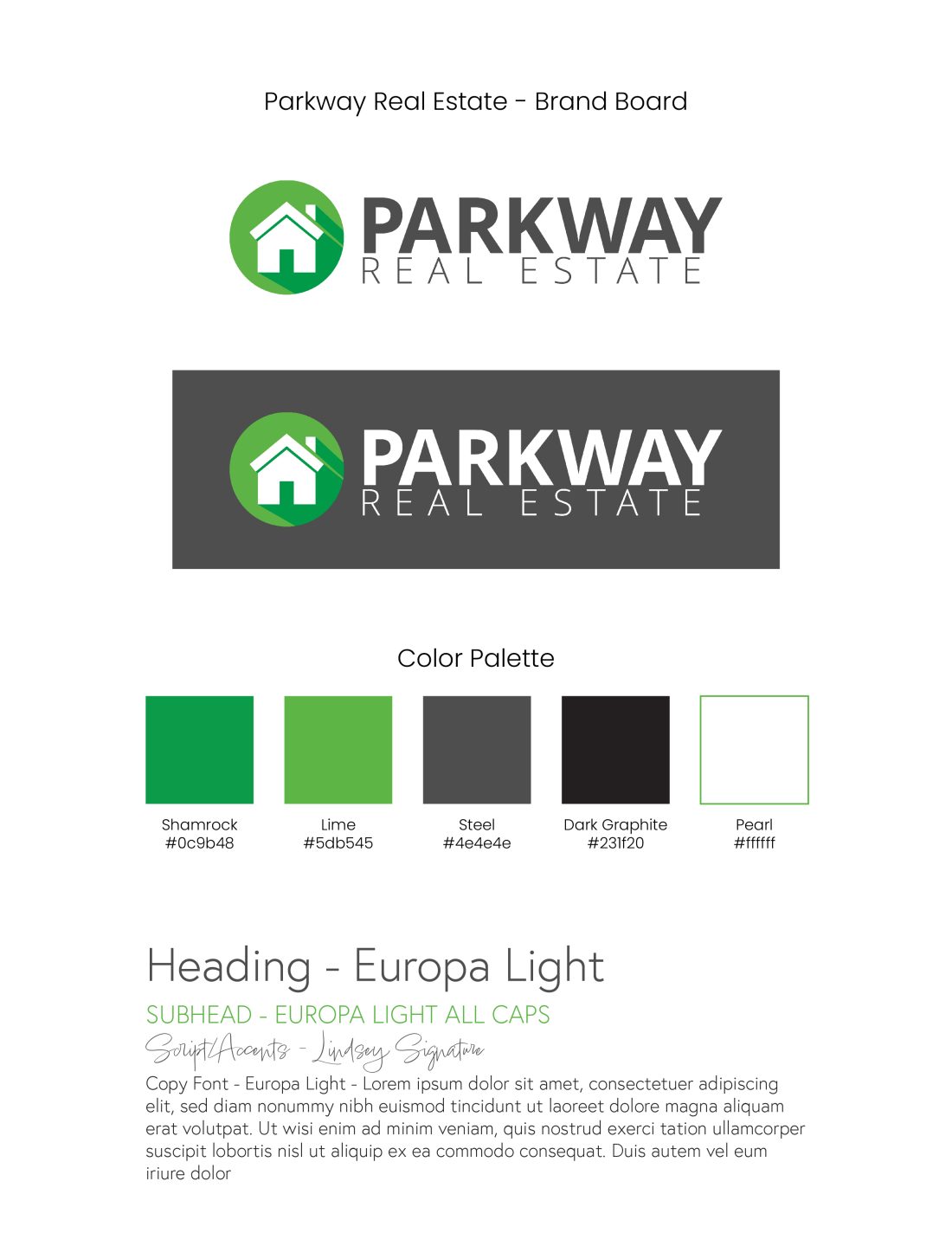
Branding | Copywriting | Website Design | Website Development
Who is Parkway Real Estate?
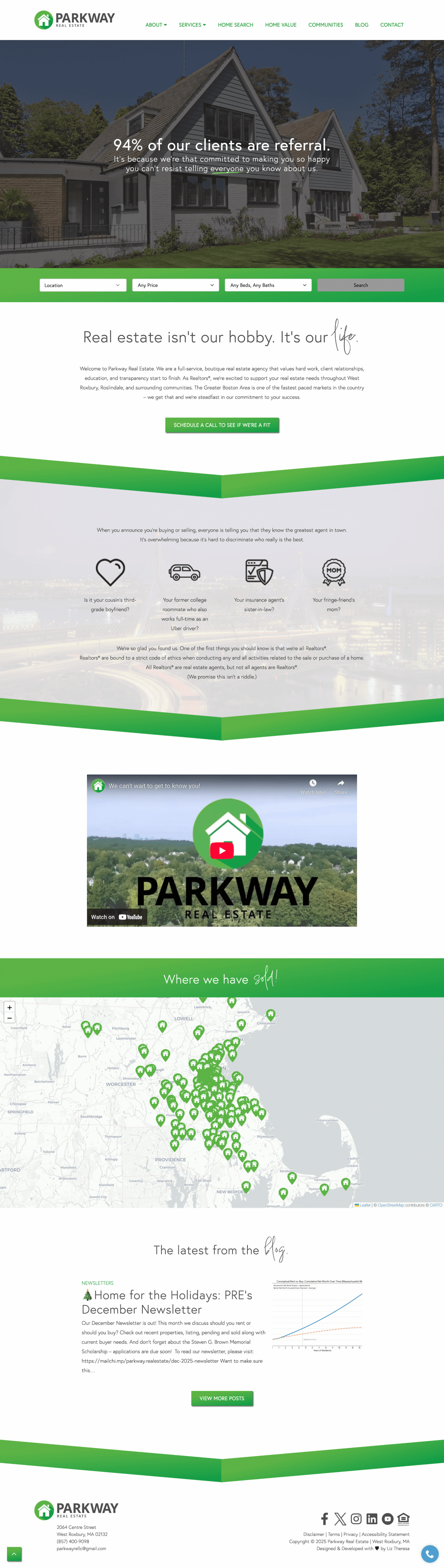
Welcome to Parkway Real Estate. We are a full service boutique real estate agency that values hard work, client relationships, education, and transparency start to finish. As Realtors®, we’re excited to support your real estate needs throughout West Roxbury, Roslindale, and surrounding communities. The Greater Boston Area is one of the fastest paced markets in the country – we get that and we’re steadfast in our commitment to your success.
Why did they come to us?
Danielle calls Parkway “the mullet of real estate – business in the front, party in the back. It is very important to me that my agents are professional, well-trained, and go above/beyond to assist in the transaction process (before, during, after). With that being said, we are people – and we like to feel connected to our clients and have fun with them – and we want the website to feel that way.” She added: “I want them to want to work with us, and want to connect with us immediately. So, the ability to text and agent, call, connect via social media, email, etc is important. Next, they need to be able to easily find info on a home they may be interested in. Next, they should easily find info on our services and the agents in our company. Followed by information items such as press around our company, and blogging.”
How did we help them?
We integrated their site with their IDX service affiliated with their MLS for easy home searching. It’s one of the better onces we’ve done (it’s stayed really nicely styled over the years!) We also kept the text a sans serif for optimal ease in legibility while adding bits for flair for the fun factor that was important to Danielle – via green underlines and a script font used in selective spots. The copy definitely also inherits the poppy undertones for a really fun read throughout the website. The menu navigation and pages are deployed rather intuitively so it’s easy to find what you need. One of the most unique parts of the site is the “Where We Have Sold” map that uses their icon-moniker as the point identifier. It makes for a beautiful interactive and branded map!
Gallery
Be the star you know you are®
We’re ready to help.
")


")